I am a fan of animation and love looking at data. But when you put the two together, there is a stronger connection between the numbers and the reader - a more fluid comprehension of what the story is behind the data, rather that just a grouping of numbers or graphs. I believe this holds true for those who don't look at data or statistics as part of our jobs or daily lives.
So, in an effort to find examples of these connections between data and understanding, I am compiling a few animations that I found make this connection in an interesting way.
Introduction to Chatroulette
Nice low-tech examples of pie charts and other visualizations using stop-motion animation. NOTE - even though the topic has potential to be "X" rated, this clip on Chatroulette is PG-13.
Michael Pollan's Food Rules
Nice illustration of a narrative recorded my Michael Pollan. While this appears to have computer assistance, the concept could be easily animated on your kitchen table or using cut-out animation of photos.
The World is Obsessed with Facebook
I put this in the category of animated info graphic. No narration - just text. Easily to follow and read and keeps your mind engaged on the content consistantly.
100 Years of Beer
Another info graphic example - ok, because beer is good
Dan's Annual Report
Guess we can now look at our own loves through info graphics.
Dataveyes Company
Good description of new careers coming up around data.
Sunday, June 24, 2012
Monday, December 6, 2010
English Class Resources
LESSON PLANS:
- Decoding the Dystopian Characteristics of Macintosh’s “1984” Commercial -- Great interactive that walks through the commercial scene by scene - prompting about the meaning of the narrative and the relationship to visual (shot).
- Audio Broadcasts and Podcasts: Oral Storytelling and Dramatization with War of the Worlds
- The Year I Was Born: An Autobiographical Research Project
- Making Connections to Myth and Folktale: The Many Ways to Rainy Mountain
- From Dr. Seuss to Jonathan Swift: Exploring the History behind the Satire
ESSAY HELP:
Thursday, July 29, 2010
Textbook Research for 2010-11
A listing of Resources and Text ideas for various subjects revolving around a film/animation curriculum.
MYTH and STORY - BOOKS
Mythology: Timeless Tales of Gods and Heroes
by Edith Hamilton - Iliad by Homer
- Odyssey by Homer
- The Penelopiad: The Myth of Penelope and Odysseus
by Margaret Atwood (Written from Penelope's perspective)
- The Myths CD Collection: A Short History of Myth/The Penelopiad/Weight
by Karen Armstrong, Margaret Atwood, Jeanette Winterson Till We Have Faces: A Myth Retold by C S Lewis (Cupid and Psyche) - The Legend of Sigurd and Gudrun by J R R Tolkien (pre-Lord of the Rings)
- Hero with a Thousand Faces
by Joseph Campbell - Metamorphoses
by Ovid The White Goddess; a historical grammar of poetic myth
by Robert Graves
LINKS -
- Classical Myth - the Ancient Sources - Univ of Victoria. Includes timeline, images and text
ANIMATION
Exploring Storyboarding (Design Exploration Series) Wendy Tumminello (Author)
Directing the Story: Professional Storytelling and Storyboarding Techniques for Live Action and Animation Francis Glebas (Author)
Cartoons: One Hundred Years of Cinema Animation Giannalberto Bendazzi
The Unseen Art Of Hollywood: A Retrospective Of Film Storyboards Trevor Goring (Author), Joyce Goring (Author)
ANATOMY and DRAWING
PHYSICS
BIBLE STUDY
- The Bible: A Biography (Books That Changed the World) Karen Armstrong (Author)
Sunday, July 4, 2010
2010 - 11 Field Trip Ideas
2010-11 SCHOOL YEAR
Listing of field trip ideas by Subject
LANGUAGE ARTS - Mythology (elements of story) / Creative Writing
- MOMA The Modern Myth: Drawing Mythologies in Modern Times March 10–September 6, 2010
- Smithsonian Amer Art Museum Telling Stories - Norman Rockwell Collections of George Lucas and Steven Spielberg July 2, 2010 - Jan. 2, 2011
MATH - Algebra
SCIENCE - Anatomy & Zoology (emphasis on animation)
- AMNH Since Darwin: The Evolution of Evolution September 12, 2009 - July 18, 2010
SCIENCE - Physics (with focus on electrical engineering applications)
- Lighting a Revolution—Electricity Hall NMAH Ongoing exhibit Visit the Exhibit online
FINE ART - Animation & Drawing
- Disney California Adventure at Disneyland to see PIXAR Toy Story Zoetrope
- Corcoran - HELIOS Eadweard Murbridge: In a time of Change (April 10 - July 18, 2010) - see the Zoopraxiscope
- MOMA Picasso: Themes and Variations March 28–August 30, 2010
- MOMA On Line: Drawing Through the Twentieth Century November 21, 2010–February 7, 2011
PRACTICAL ARTS - Web Development (Typing, HTML, Photoshop at HCC)
- MOMA Pictures by Women: A History of Modern Photography
May 7, 2010–March 21, 2011
PRACTICAL ARTS - Invention (Young Inventors at HCC)
- Artifact Walls - Toys from the Attic NMAH Ongoing exhibit
- Invention at Play NMAH Ongoing exhibit Visit the exhibit online
- Invention Case: Hot Spots of Invention NMAH Ongoing exhibit
- Invention Case: Toying with Invention NMAH Ongoing exhibit
SPANISH (1st year)
- Smithsonian Folklife Festival featuring Mexico (July 2010)
HEALTH - general High School Health course
- Key Ingredients - America by Food online & traveling exhibit
PHYS ED - Biking (DC to Pittsburgh Aug 2010)
DRAMA - Musical Theater (Jan-Mar 2011)
- Ain’t Nothing Like the Real Thing: How the Apollo Theater Shaped American Entertainment NMAH April 23, 2010–August 29, 2010
- Nat'l Portrait Gallery One Life: Echoes of Elvis January 8, 2010 - August 29, 2010
- NEWSEUM Elvis! at the Newseum thru Feb. 14, 2011
JUST FOR FUN
- NMAH - Paper Engineering: Fold, Pull, Pop & Turn
June 14, 2010–September 1, 2011
Got any ideas? Leave them in the comments section.
Anatomy Class links
ANATOMY & PHYSIOLOGY for ANIMATORS
(tracking links and resources for teaching anatomy)
WEB RESOURCES
(tracking links and resources for teaching anatomy)
WEB RESOURCES
- Get Body Smart Interactive tutorials of skeletal systems. Flash with Quizes
- Mc Graw Hill Biology FREE Animations
- Gel Person to Teach Human Anatomy (and medical imaging)
- Grey's Anatomy Online
Monday, October 26, 2009

Monday, May 4, 2009
Politics & Mood - Is there a relationship between frequent mental distress and voting shifts?
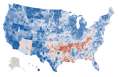
A recent National Geographic News article reports that a study in the upcoming issue of the American Journal of Preventive Medicine shows a county-by-county map with percentages of US residents who reported "frequent mental distress" (FMD). FMD is defined as 14 or more days of emotional discomfort, including "stress, depression and problems with emotion," during the previous month. Data in this map shows results from CDC telephone survey between 2003 and 2006. (NOTE: 3-days of emotional discomfort is considered normal).
 The study found that you're most likely to suffer periods of depression, stress, or other emotional problems if you live in the United States' Appalachian or Mississippi Valley regions—or at least that you're most likely to admit it to government survey takers.
 The study found that you're most likely to suffer periods of depression, stress, or other emotional problems if you live in the United States' Appalachian or Mississippi Valley regions—or at least that you're most likely to admit it to government survey takers.
It is interesting to compare this geographic distribution with the shift of voting patterns in the 2008 election. This is what I LOVE about geography and data – show data visually and you can really see some dramatic correlations. Hmmmm, I think I see a research project in here ;-) Would be interesting to see a voting shift map from 2006 – which is closer aligned to the data collected on mental heath.
Subscribe to:
Posts (Atom)